Sunday 9 October 2011

Blog Assignment 10

Postmodernist and ‘remix’ techniques are a vibrant part of our
design culture today. Find an example of contemporary design—
2D or 3D—and post it to your blog along with a description of
what techniques it utilises (i.e. historical quotation, ornamental
eclecticism, wit or irony, manipulations of scale, cultural
symbols etc.) and how they serve to ‘add meaning’ to the work.

This week I am going to talk about a design from The Cool Hunter, a website and group of people devoted to 'cool' things. In 2010 they launched a program called Access Agency. It is designed to help companies with offline branding exercises. The design below, of some McDonalds chips in a Gucci branded box, was one of the designs on display. The use of a well known, flashy, designer brand to promote some chips changes the way we perceive them. We all know that they are McDonalds chips but we can think of them being much better and higher quality if Gucci is being used to promote them.


The Cool Hunter say that “ we add substantial value by creating customized experiences that change the consumers’ thinking in some way. The surprise element changes the thinking patterns, and the change makes the experience memorable.” This interested me because the concept, having a really upmarket McDonalds store, is so ridiculous in a first impression. The very idea of promoting McDonalds as a upmarket restaurant is not that surprising, we can already see a trend in their own advertising to promote good health and flash dining.

This particular design would enhance the user's, or viewer's, perception of the company. A good, surprising, use of advertising will always lead to us believing it is a better product. It is still the same of crappy McDonalds fries but presented in such a nice way we can forget that and gain a much more pleasing experience from the 'restaurant'. I will finish this series of blog posts with a very memorable quote from my cousin Harry: “Remember, even if it tastes like shit, if it looks like it will taste nice, people will eat it.”

Figure 1. Guccifries. Retrieved from http://www.thecoolhunter.com.au/images/guccifries.jpg

Friday 30 September 2011

Blog Assignment Week 12

What kinds of political or ideological messages inform design or
the branding of design today? Identify one example and
describe in what ways it expresses larger cultural, political, or
ideological beliefs.

Recently the design world, mainly in advertising and product design has been focused on eco-design. The world has been flung into some kind of apocalypse frenzy where the world is going to end if nothing gets changed. The problem is that nothing is getting changed.

If we look at major companies like Nike and Puma Footwear, they seem to only be changing their eco viewpoint to please customers. As soon as this global issue of global warming sprung up in 2005, and globalized by 'An Inconvenient Truth', companies were quick to jump on the bandwagon of eco-design.


These ideological ideas were quickly adapted into the advertising world. For example, the Puma Clever Little Box, shown below, is a new show box designed by Puma to be as eco-friendly as possible. The box uses 65% less cardboard then a regular shoe box, aswell as doubling as a reusable carrier bag. I have no problem with this, in fact it's good to see a company actually trying to make a difference. I do, however, have a problem with the way it's advertised.


It seems that this box was not, initially, designed for the consumer's use. The box is incredibly useless at being a shoebox, so much that I would prefer a normal shoe box. The entire box is covered with advertising. Not advertising for the products inside but for how eco-friendly it is. This pisses me off. It's obvious that these are only there for the company to show off to its consumers, saying 'hey, look at how awesome and eco-friendly we are!'

It is advertising like this that clearly shows how political and ideological messages are informing design or the branding of design today. 

Figure 1, An Inconvenient Truth Poster. Retrieved from: http://slapnose.com/images/blog/0606/0606-inconvenient-truth.jpg
Figure 2. Puma Clever Little Shoe Box. Retrieved from: http://inhabitat.com/wp-content/blogs.dir/1/files/2010/04/puma-clever-little-bag.jpg

Friday 23 September 2011

Blog Assignment Week 11

Hannes Meyer, director of the Bauhaus, argued that “design is a product of function X enonomy.” (Raizman, The first machine age in Europe). This allowed design to align with scientific models driven by new technologies and manufacturing potentials. He believed that designers should be focusing more on function and cost rather than elegance and aesthetics.


A good example of design through function X economy are these stools, shown above. Whilst been relatively unpleasant to the eye, they are extremely functional and economical. Not only are they very cheap and easy to make, but they do everything a stool should do. They allow people to sit on them around a table or bench.

Now compare those to the stool below. This is a good example of design for pleasure. This stool is made of a more complex material and clearly costs for to produce and purchase. However, they do allow the same sitting satisfaction as the stools above. And, better than the stools above they actually look nice. But this comes at a cost, the price of purchase and production.


A great benefit for the stools above compared to the ones below is that they can be stacked easily. This is an incredibly simple design addition that greatly increases the function of the stools above. Space is a key issue around the household and these stools combat that. Compared to the other stools which cant stack up at all, wasting valuable space when not needed.

I agree with Meyer that design should be a product of function X economy and also believe that design today should both science and art. Why should it be classified as one or the other? If it were all science it would be science. The same with art. There is a perfect balance for design to be both. Designers should be thinking not only about the art (aesthetics) of an object but also the science (the function and economy). This will allow us to deliver the best the we can offer as designers. There is no point designing an object is the production costs are unbearably high for the function of the object.

Hence the reason why the top stools are clearly better designed for a working class market. The immense reduction in production cost can be passed onto the customer and the added benefits are a blessing on top of this.


D. Raizman. (n.d). The first machine age in Europe.
http://besttopdesign.com/wp-content/uploads/2009/07/the-flow-stool-classic-seating-design-1.jpg
http://www.makingthemodernworld.org.uk/stories/the_rise_of_consumerism/01.ST.05/img/IM.0462_zp.jpg

Friday 16 September 2011

Blog Assignment Week 10

In this week’s lecture we discussed the concept of the “symbolic
universe” as a cultural “structure of legitimation” capable of
organizing the social world as comprehensible and connected.
The structure of the symbolic universe then, places the
individual in a known and knowable space. Such social
structures are critical for societies in transition. Can you identify
the creation of any “symbolic universe” today (or in recent
years)? How might media and design be implicated in the
construction of these social universes today?

Symbolic universes help societies discover their place in the world by creating a fictional universe that people can relate to.

There is a craze for war-based video games. In the early 00's war games would be all about world war II. Games such as Call of Duty and Medal of Honour put players in the war fighting to save their countries. This helped give context to what it would be like to be in the war.

More recently the games have been focused on modern warfare, especially in the middle east. These games give great fictional universes where people can partake in the war, without being in danger itself. This allows people to learn about the war, and what is going on in the world around them, whilst having fun. This is helpful as it gives a new perspective to the war that was not seen during the early 00's.

Recently, as in last month, a Brisbane based studio called Defiant Development has released the first footage for their new game Warco. This game is again focused in the modern war, however you are not a soldier. You are a war correspondent. Being marketed as a war game with guns replaced by cameras, this game helps players grasp the world of the war correspondent. We are all able to watch the news and see what is happening in the war, but most of us forget, or don't worry about the person behind the camera.

The best part about this game is the way it has been designed. The focus being less on the action and firefights of the war but about the politics and documentary of the war. This has never been achieved in any of the previous combat-based games. This change of perspective allows players to experience the world of warfare in a completely new way.

Thursday 8 September 2011

Blog Assignment Week 9

In the early 19th Century, when photography was a new media in the world, artists and designers noticed a lack of art that could be reproduced easily. Once art had been designed to be able to be reproduced the artwork lost all authenticity. Walter Benjamin in 1935 said “To an ever greater
degree the work of art reproduced becomes the work of art designed for reproducibility.”


I completely agree with Benjamin's statement. Once we begin to design objects for mass reproduction we can no longer credit them as being authentic and/or art. To me, art can only be made once. If an object is able to be reproduced then there is no awe or amazement associated with it. An item such as the Buddha carved into teak (artist unknown) shown above would take hours of precise work and skill. Because of this we can feel a sense of amazement when we see sculptures like this.


However, and object like the print of the flower (artist unknown) shown below, although is beautiful to look at, loses its authenticity and awe. Because it is reproduced many times over it has no emotive connection with the artist who originally made it. Therefore to call them authentic art is wrong.

In the world today there are places for genuine art and places for art designed for reproducibility, but to think of them both as equal is, to me, definitely incorrect. And as Benjamin stated if we continue to try to reproduce our art it will ultimately be designed with reproduction in mind.

Thursday 11 August 2011

Blog Assignment 5

Artists have always experimented with different art forms and styles. This has lead to many discoveries and failures, the discoveries led to new techniques and styles.

Sir Isaac Newton was one of the first to start experimenting with colors. His take on the color wheels and complimentary colors was revolutionary at the time.

For example, Michel Eugene Chevreul said that "two adjacent colors when seen by the eye will appear as dissimilar as possible." (Chevruel, 1836)

Near the end of the 19th century, Impressionism was the top form of experimentation with colors. Artists were moving away from representation painting, where they would paint something as it looked. By discovering the essence of visual perception and looking into the psychological image of an object, the artists really took painting in a whole new direction.


In Paul Gauguin's Blue Trees, 1888, we can see an odd inclusion of color choices. Normally trees are not blue, but Gauguin is trying to show us how our head sees the trees rather than how our eyes see them.

Vinvent Van Gogh was also, around the same time, interested in experimenting with colors, as seen in his painting: Roots and Tree Trunks, 1890.

Through experimenting our experiences with color and light these artists have strongly developed our understanding of color.

M.E.Chevruel, 1836, in M.Petty, 2011, Color, Perception and Abstraction, slide 6
Figure 1. Gauguin. P. 1888. Blue Trees. Retrieved from http://www.picturalissim.com/t/gauguin_blue_tree_trunks.jpg.

Thursday 4 August 2011

Blog Assignment 4

As long as there have been humans, there has been ornament. “The ornament … being the result of [our] natural instinct.” (Jones, 1856)

Alfred Loos argued that “The evolution of culture is synonymous with the removal of ornament
from objects of daily use.” (Loos, 1908) This is evident as we can see a vast change of the amount of ornament in our culture since as late as the 19th century. In 18th century France, for instance, the royal family was obsessed with ornament and decoration. Because of this, the style of architecture and design of the period is heavily decorated, as seen in the Candelabrum (Jean-Joseph de Saint-Germain, 1750), shown below. The heavily decorated objects put large strains on the society at the time. The production costs were too high, only the higher classes could afford them and the objects could not be mass produced.


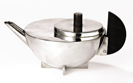
I agree with Loos on this topic. We can see a substantial decrease in the amount of ornamentation on objects. From the decline of the rococo period through to the rise of modernism, we can see a shift towards form and function rather than beauty and moral virtue. A good example of this is the Tea Pot (M. Brandt, 1926) from the Bauhaus, shown below. It is almost completely without decoration. This object is fully focused on its form, using geometrical shapes and simple materials, it is a key element in the modernistic design style.


Throughout time, the decoration of our design and architectural styles has slowly been reduced. The decline in ornamentation is directly related to the evolution of our cultures. 


Loos, Ornament and Crime, 1908
Jones, Ornament of Savage Tribes, 1856
Figure 1. Saint-Germain, J. 1750. Candelabrum. Retrieved from http://graphics8.nytimes.com/images/2008/03/07/arts/07roco-190.jpg
Figure 2. Brandt, M. 1926. Tea Pot. Bauhaus Dessau. Retrieved from http://static.dezeen.com/uploads/2007/12/8459-tea-infuser.jpg